Salus iT500
The brief for this job was to redesign an app that controls an internet connected smart thermostat. One of the challenges was that we had to work with the existing model of thermostat, so were restricted in terms of adding new functionality. Our main objective was to improve the experience of using the thermostat by creating a companion app that was clear, attractive and easy to use.
Research
The first steps involved face-to-face workshops with the client in order to discuss the problems with the current app, use cases for the new app and key features we should aim to include. Features were sorted by desirability and complexity in order to decide on their priority. At this early stage, we began sketching ideas for the main paradigms of the app, such as how we would be displaying temperature and scheduling.
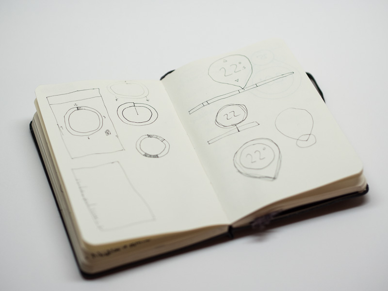
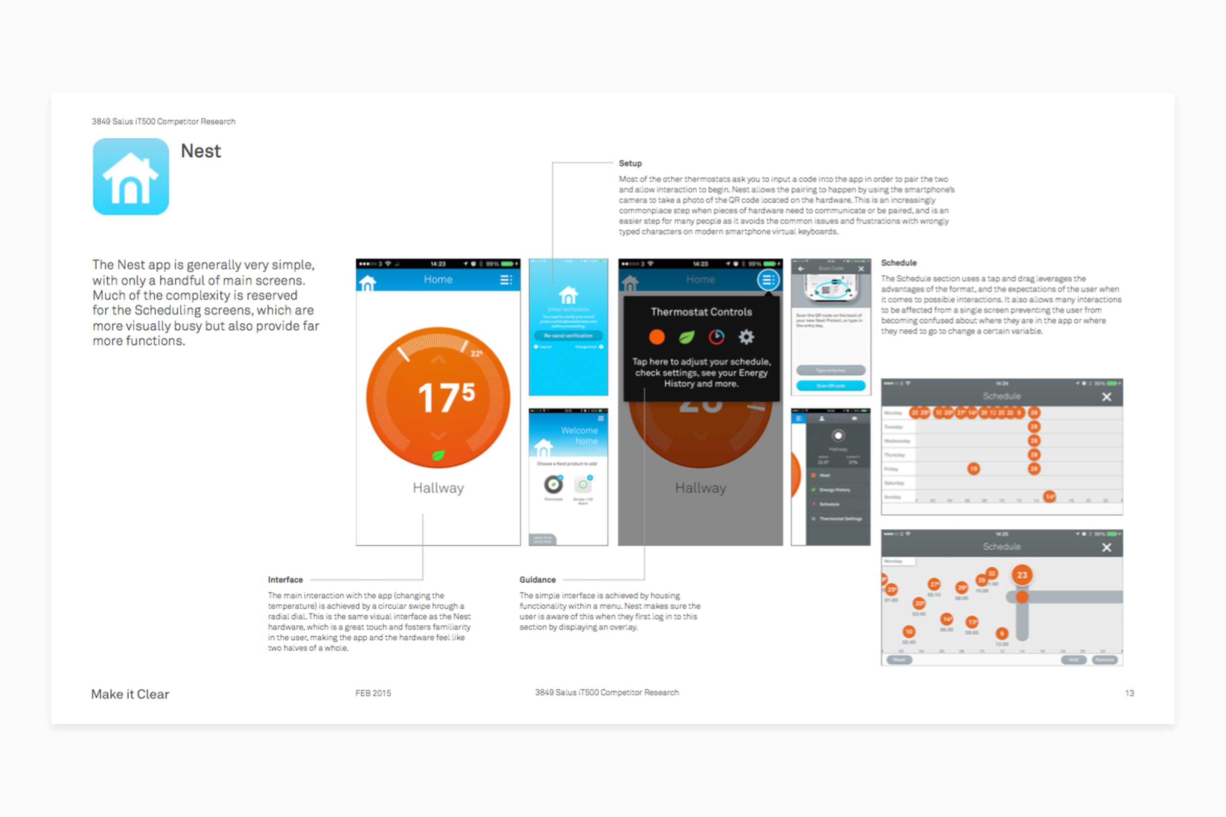
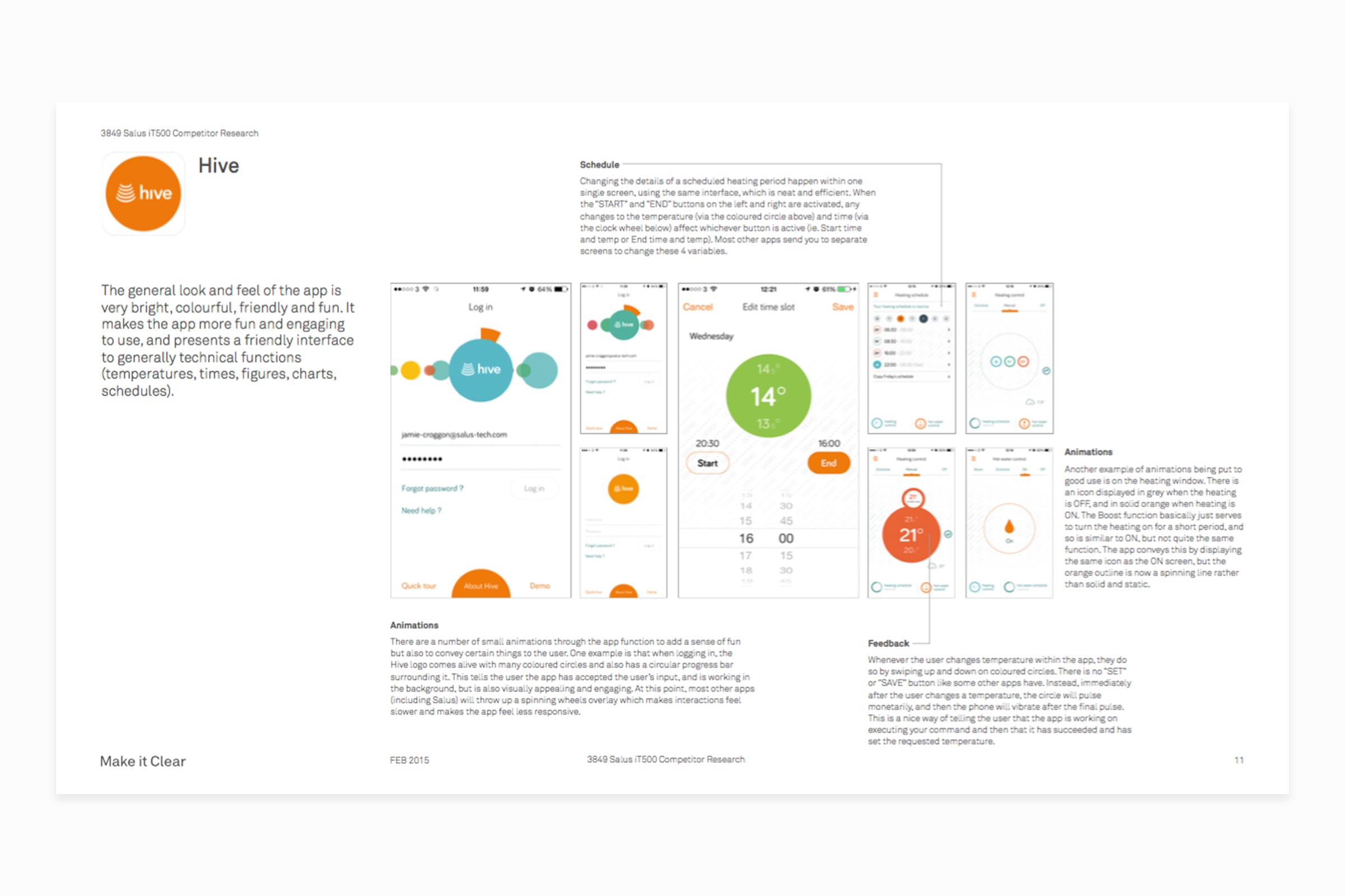
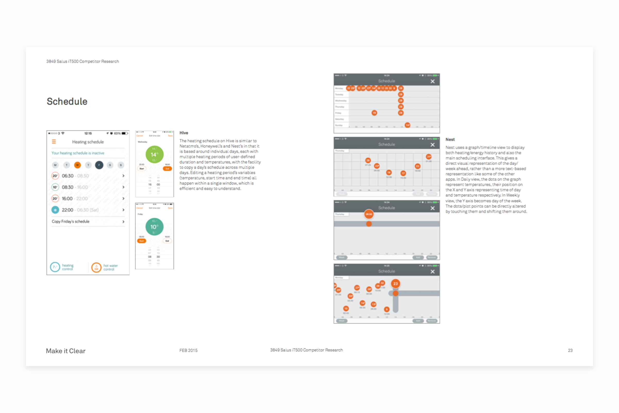
Alongside the very early sketching, we analysed competitor's apps to look for conventions, and to better understand the benchmark that we wanted our app to exceed. We also looked beyond thermostat apps to overall digital interfaces to see how the key tenets of the app (scheduling, data display etc) were handled well, and where we could improve upon current implementations.
Prototyping
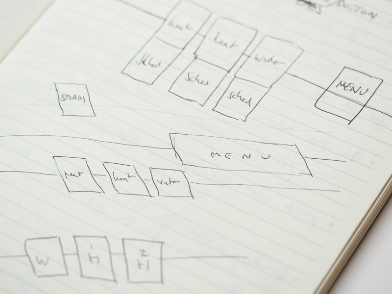
As our sketches of the app's structure and features developed, we began to map out how the app might be structured spatially. This helped us take stock of all the screens that would need to be designed, and also informed the logic of screen transitions. We established a list of key tasks users would want to carry out, and built InVision prototypes to test for things like clarity and dead ends. Iterating on these prototypes let us propose more efficient ways of achieving certain tasks, and aided clarity by showing us when screens were either missing information or were becoming crowded, for example.
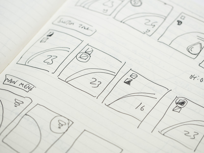
Structure of the app

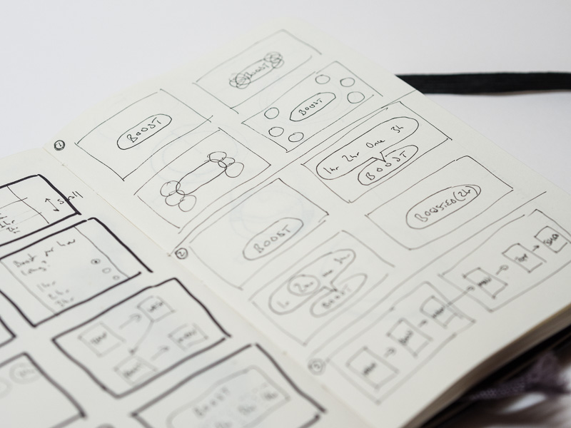
Examples of early wireframes
UI Exploration
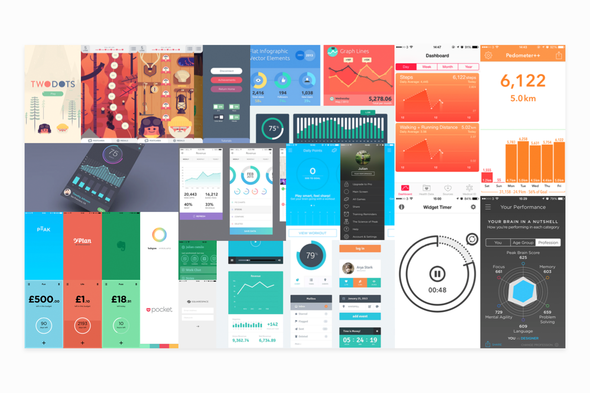
Once basic functionality and user flows were decided upon, the next step was to begin exploring the look and feel of the app. From our early discussions with the client, there was an idea about a very general visual direction. This combined with our research up to this point led to us proposing a number of style concepts for the user interface.

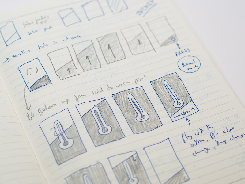
Examples of an alternative UI concept experiment
Outcome
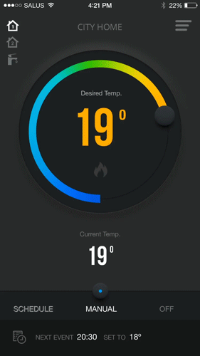
Rounds of feedback and iteration led to a UI look and feel taking shape. My role was to produce designs for every screen that would comprise the app. This included designing interfaces for functions such as scheduling, manual override and the user onboarding process. Part of my role was to liaise with the app's developers to provide assets, advise on UI issues, and also to produce animations of how the app should move and behave. This includes screen transitions that help keep the user oriented, and certain animations that help communicate button functions more clearly.


Conclusion
I feel that we delivered an app design which was a vast improvement on the previous version, with initial feedback from users being very positive. Whilst there are some performance issues, these stem from the requirement for the new app to communicate with the existing hardware using existing APIs, and it is therefore subject to existing limitations in speed and functionality. I feel that we have delivered a much improved experience for the user with a clear and engaging interface.